Case study
Next case studySmall changes for big impact
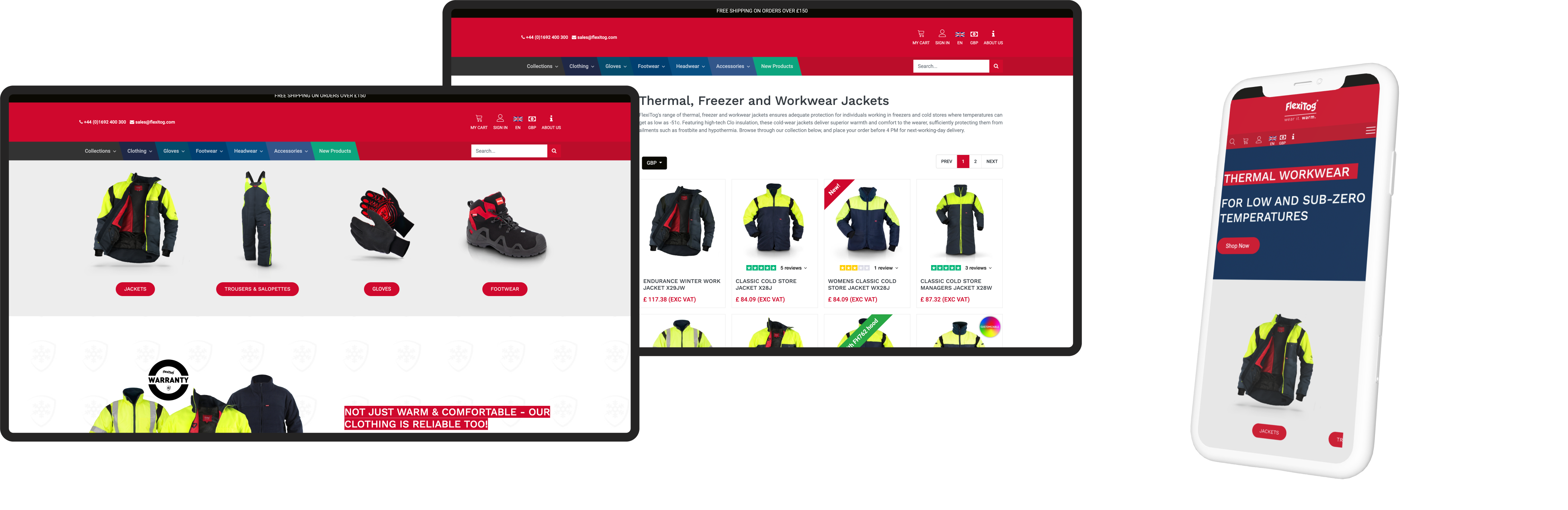
A leading European supplier of cold-temperature protective workwear sought to enhance their website’s user experience and conversion rate. With their traditional B2B model using product codes and brochures, the expansion into direct consumer sales revealed significant usability challenges on their site.
The challenge: finding the problem
For business clients, the website’s existing navigation was functional. However, with the rise in direct consumer traffic, it became evident that the site’s primary navigation was insufficient for helping users find what they needed. Users were frequently getting lost, leading to lower conversion rates. The team contemplated a major navigation redesign but needed validation on whether this extensive overhaul was necessary.
The solution: re-evaluating the problem
Instead of diving into an expensive redesign, we took a step back and looked at the data. Surprisingly, the primary navigation wasn’t the problem. Instead, we found that users were stumbling because the content structure and organisation weren’t up to scratch. They were spending too much time searching for products, getting sidetracked, and abandoning their carts.
Here’s how we tackled it:
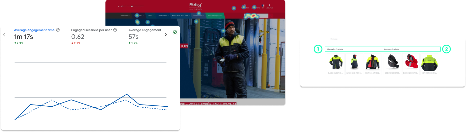
- Content audit: We kicked off with a detailed content audit to see how everything was laid out and where users were hitting roadblocks.
- Revised information architecture (IA): We revamped the IA to make content easier to find. By reorganising and grouping information logically, we created a smoother user journey.
- Streamlined user pathways: We trimmed down the bulky hero sections that were blocking the view and repositioned key navigational aids to be more accessible. This made it simpler for users to navigate and explore product categories.
- Optimised mobile experience: With more users on mobile, we cleaned up the mobile version, adjusting content and element behaviours for a more intuitive experience. Horizontal scrolls for product categories and decluttered layouts made a big difference.
The outcome: big wins from smart tweaks
The results were impressive. Year on year, the company saw a 12% increase in revenue fuelled by a 214% increase in purchase events and, with an 8.5% increase in users still saw a 6% decrease in page views - a result of clearer and more direct path to purchase.
increase in purchase events
increase in revenue
increase in spend per user
By refining the content structure, we made navigation much smoother, significantly reducing the number of clicks needed to reach the shopping cart. This improvement led to a noticeable increase in conversion rates, as users experienced a more straightforward purchase process. Additionally, with a clearer path to purchase, cart abandonment rates dropped, showing that users were successfully finding and completing their purchases.
This case study demonstrates the profound impact of a strategic approach to content structure and organisation. By focusing on these aspects, we transformed a B2B e-commerce platform, smoothing it's transition into the B2C space.